When AI starts designing your user interfaces, things get fast-but also messy. You can generate a full screen of buttons, cards, and forms in seconds. But then you notice: the spacing is off, the colors don’t match your brand, and the button labels are inconsistent. That’s not innovation. That’s chaos dressed up as automation.
AI doesn’t know your design system unless you teach it. And if you don’t teach it well, it will invent its own rules. And those rules will break your product.
Why AI-Generated UI Breaks Consistency
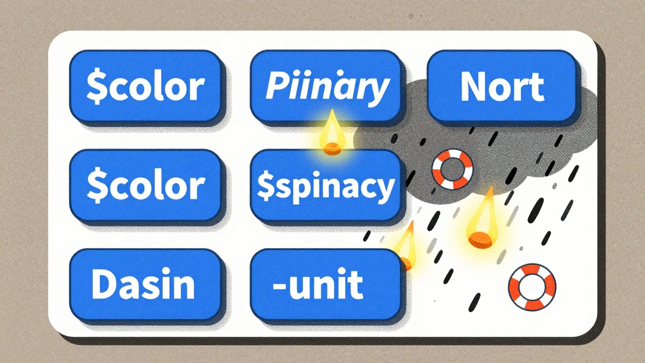
AI tools like Components AI, UXPin Merge, and Motiff AI are great at generating UI from text prompts. Type “login screen with blue theme” and you get something. But what does “blue” mean to the AI? Is it #0066CC? #1A73E8? Or just any shade that looks “blue-ish”? Without constraints, AI picks randomly. And that’s the problem.
Design systems exist to remove guesswork. They define exact values: spacing in 4px increments, typography using only two fonts, colors pulled from a fixed palette. But AI doesn’t care about your style guide unless you lock it in.
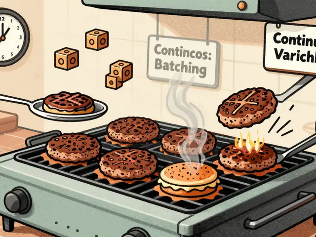
Early adopters found this out the hard way. One team at a SaaS company used an AI tool to generate 50 new screens in a week. By week two, their app had seven different button styles, three font sizes for headings, and five shades of “primary blue.” The design team spent 40 hours fixing what the AI made in 40 minutes.
AI isn’t the enemy. It’s a junior designer who’s brilliant at copying patterns-but terrible at understanding why they exist.
Design Tokens: The Foundation of Consistency
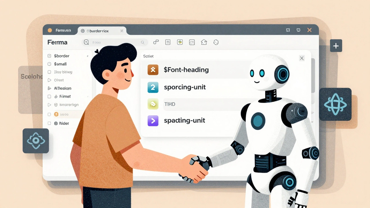
The only way to keep AI in line is through design tokens. These aren’t just colors or fonts. They’re named variables that represent your brand’s design language.
For example:
$color-primary= #1A73E8$spacing-unit= 8px$border-radius-small= 4px$font-heading= Inter, 24px, 700
When you feed these tokens into your AI tool, it doesn’t guess. It uses your exact values. Components AI and UXPin Merge let you import these directly from Figma or CSS. Motiff AI pulls them from your existing design system libraries like Material or Shadcn.
Teams that use design tokens report 80% fewer inconsistencies in AI-generated outputs. But here’s the catch: your tokens have to be complete. Missing a token for button padding? The AI will invent one. And it won’t be right.
Start by auditing your current design system. List every color, spacing value, corner radius, and font size you use. Turn them into tokens. Document them. Then lock them into your AI tool.
Training AI on Your Design System
You can’t just plug in tokens and expect magic. AI needs context.
Brad Frost’s experiments showed that training a large language model on your actual component code-React, Vue, or HTML-makes a huge difference. If your button component always uses padding: $spacing-unit * 2 and border-radius: $border-radius-small, the AI learns that pattern.
Here’s how to train it:
- Collect 15-20 real examples of your most-used components (buttons, modals, cards, forms).
- Include the code, the design token usage, and any documentation about variants (hover state, disabled, loading).
- Feed this into your AI tool’s training interface (if available) or use it as reference prompts.
Once trained, the AI starts generating components that look like they came from your team-not a random generator. It knows your spacing rhythm. It knows your button shapes. It knows why you use 16px padding on buttons but 12px on icons.
Without this step, you’re just asking the AI to guess your style. And it will guess wrong.
Tools Compared: What Works Today
Not all AI design tools are built the same. Here’s how the top players handle consistency:
| Tool | Design Token Support | Real Components? | Accessibility Auto-Check | Best For |
|---|---|---|---|---|
| Components AI | Yes (CSS, JSON, Sass) | No (visual only) | No | Startups needing fast, brand-aligned visuals |
| UXPin Merge | Yes (imports from Figma + code) | Yes (React, Web components) | Partial | Teams struggling with design-to-dev handoff |
| Motiff AI | Yes (Material, Ant, Shadcn) | Yes (auto-generated code) | Planned for 2024 | Teams wanting production-ready output |
| UX Pilot | Yes (Figma integration) | No | No | Designers needing fine-grained control |
UXPin Merge stands out because it doesn’t just generate mockups-it generates real, working React components. That means your designers aren’t just creating pixels. They’re building code that developers can use immediately. No more “export as PNG and hope it matches.”
But no tool gets accessibility right yet. Design System Diaries found that AI-generated components only meet 50-80% of WCAG 2.1 standards. That means every button, form, and modal still needs human review for contrast, focus states, and screen reader labels.
The Human-in-the-Loop Rule
AI is not a replacement for designers. It’s a co-pilot.
The most successful teams treat AI output as a first draft. They call it the “scaffold approach.” The AI builds the structure. The human adds the soul.
Here’s how it works:
- AI generates a component from a prompt.
- Designer checks: Does it use the right tokens? Is spacing consistent? Are colors correct?
- Developer reviews: Is the code clean? Does it meet accessibility standards? Is it responsive?
- Both approve → component goes to production.
This cuts development time by 60% but keeps quality high. One team at a fintech startup reduced their UI build time from 3 days to 12 hours-not because AI did it all, but because it did the boring parts.
And here’s the secret: the more you refine AI output, the smarter it gets. Each correction becomes a new training example. Over time, it learns your standards. It stops making the same mistakes.
Common Pitfalls and How to Avoid Them
Here’s what goes wrong-and how to fix it:
- Pitfall: AI uses wrong color values. Fix: Lock your color tokens. Never let the AI pick from a palette. Use exact hex codes.
- Pitfall: Spacing is inconsistent. Fix: Use a modular scale (4px, 8px, 16px, 24px). Never allow arbitrary values.
- Pitfall: Buttons don’t have hover states. Fix: Document all component variants. Tell the AI: “Every button must have hover, active, and disabled states.”
- Pitfall: AI ignores mobile layouts. Fix: Train it on responsive examples. Show it how your grid collapses on small screens.
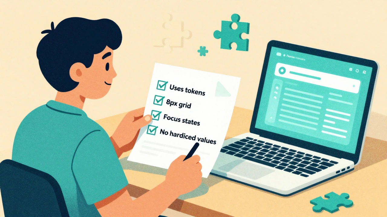
One team fixed 90% of their issues by creating a simple checklist for AI-generated components:
- ✅ Uses only approved design tokens
- ✅ Spacing follows 8px grid
- ✅ All interactive elements have focus states
- ✅ Text has minimum 4.5:1 contrast
- ✅ No hardcoded values-everything is token-based
They printed it. Put it on their wall. Every AI-generated component had to pass this before review.
Getting Started: Your 3-Step Plan
Don’t try to overhaul everything at once. Start small.
- Define your tokens. List every color, font, spacing, and radius you use. Put them in a JSON or CSS file. Make sure they’re documented.
- Choose one tool. Pick one AI design tool that supports your stack. UXPin Merge if you use React. Components AI if you want open-source and visual control.
- Train it on one component. Pick your most-used component-maybe a button or card. Feed it 10 real examples. Test it. Refine. Repeat.
Within two weeks, you’ll have a working pipeline. In a month, your team will be generating UI faster than ever-with zero consistency nightmares.
What’s Next: The Future of AI Design Systems
By 2026, every design team will use AI to generate UI. But only those with strong design systems will survive.
The trend is shifting from rigid component libraries to “generative component frameworks.” Instead of storing 50 pre-built buttons, you store rules. The AI builds the button on demand-using your tokens, your spacing, your style.
That’s the future: lighter systems, smarter AI, and humans in control.
But right now? You still need to teach your AI. Otherwise, it won’t just be slow. It’ll be wrong.


Fred Edwords
10 December, 2025 - 00:10 AM
Design tokens aren’t just a best practice-they’re a lifeline. I’ve seen teams try to wing it with AI-generated UIs, and it’s like handing a toddler a chainsaw. One team I consulted had 14 different shades of ‘blue’ in a single dashboard. Fourteen. I had to sit down with their Figma file, export every single color value, and turn them into tokens. Took three days. Saved them 40 hours a week after that. The key? Document everything-even the ‘obvious’ stuff. If you don’t, the AI will invent its own mythology. And trust me, it’s not a mythology you want to live in.
Sarah McWhirter
11 December, 2025 - 14:16 PM
Okay, but what if the design system itself is the problem? 🤔
What if your ‘tokens’ are just corporate bureaucracy dressed up as ‘consistency’? I mean, who decided $color-primary had to be #1A73E8? Was it a committee? A marketing intern? A bot trained on 2012 Apple ads?
AI isn’t breaking your system-it’s exposing it. Maybe your ‘brand guidelines’ are just a fossilized relic of someone’s aesthetic from 2015. Maybe the AI is the only thing left with a pulse. Maybe we’re not teaching AI our system… we’re teaching it how to outgrow us. Just saying. 😇
Ananya Sharma
13 December, 2025 - 10:28 AM
You’re all missing the real issue here. This entire ‘design token’ movement is just a capitalist placebo for design teams who’ve lost their creative autonomy. You think locking in $spacing-unit = 8px makes you ‘consistent’? No. It makes you predictable. It makes you boring. It makes you complicit in the neoliberal homogenization of digital experience.
Look at the tools listed-UXPin Merge, Components AI-they’re all owned by venture-backed startups whose endgame is to commodify design into a SaaS subscription. And you’re all cheerleading it like it’s progress. Meanwhile, real designers are being pushed out of the loop, replaced by tokenized templates and AI-generated ‘scaffolds.’
And don’t even get me started on accessibility. You think AI can understand contrast ratios for color-blind users? It doesn’t know what ‘inclusion’ means. It just spits out pixels based on a JSON file. Your ‘human-in-the-loop’ is just a glorified QA checker for algorithmic mediocrity. The future isn’t ‘smarter AI.’ It’s a return to craft. To intention. To human judgment. Not tokens. Not tools. Not automation. Just… people. Who care.
kelvin kind
15 December, 2025 - 09:44 AM
Just used this method on a side project. Made tokens for colors and spacing, fed 5 buttons into Components AI, and it spat out something that actually looked like mine. No more guessing. Took 10 minutes. Life’s good.
Ian Cassidy
15 December, 2025 - 23:08 PM
Token-based design is the only way forward. AI needs deterministic inputs-no ambiguity. If you’re using hex codes directly in CSS, you’re doing it wrong. Use CSS variables or a token manager like Style Dictionary. And don’t forget to version your tokens. I’ve seen teams break prod because someone changed $border-radius-small in Figma and forgot to sync. It’s not magic. It’s infrastructure. Treat it like code. Because it is.